Monday, 29 May 2017

Stencil fun


Saturday I had the pleasure of being a student in a class at The Scrapbook Store in North Perth.Class booked on a whim .. some 'me time' ... much needed at the moment. This is my first play at home using the techniques we learned. One day I'll get a camera that shows colours correctly. There is a subtle lilac shimmer framing the flowers, and the flowers are shiny.


This second shot shows the shimmer, but the colours are now totally incorrect.


I have two more panels made at the same time .. I just need to turn them into cards. I love how rich the gold looks.


For the panel on the right I mixed shabby shutters Distress Ink refill with water and a little Perfect Pearls and sprayed the lower half of the panel with that. Lots more ideas forming on ways to use this technique!


Tuesday, 23 May 2017

Shaker card

We are going to be playing with shaker cards this Friday at the Social Capers gathering.


This is yesterday's 'quick' make (quick being that it did not take the whole day) (and it will be much quicker if I make it again) ...
I wanted a variety of leaves but only have one tiny Carl leaf punch, so I clear heat-embossed 1/3 of the autumn leaves paper strip I was punching from and Bronze Zing heat-embossed another 1/3 of the paper strip before punching. I also added gold micro beads to the shaky stuff.

The wording was computer-printed onto vellum before
die-cutting the leaf shape, and is edged with rusty hinge Distress ink.


The photo to the right shows better the sparkle on the copper leaves - sorry about the flash flare from the acetate.


The intention was a sympathy card that is not black and sombre - though my Second Thoughts wonder if a shaker card is appropriate ... at the time I was focused on the falling leaves aspect.


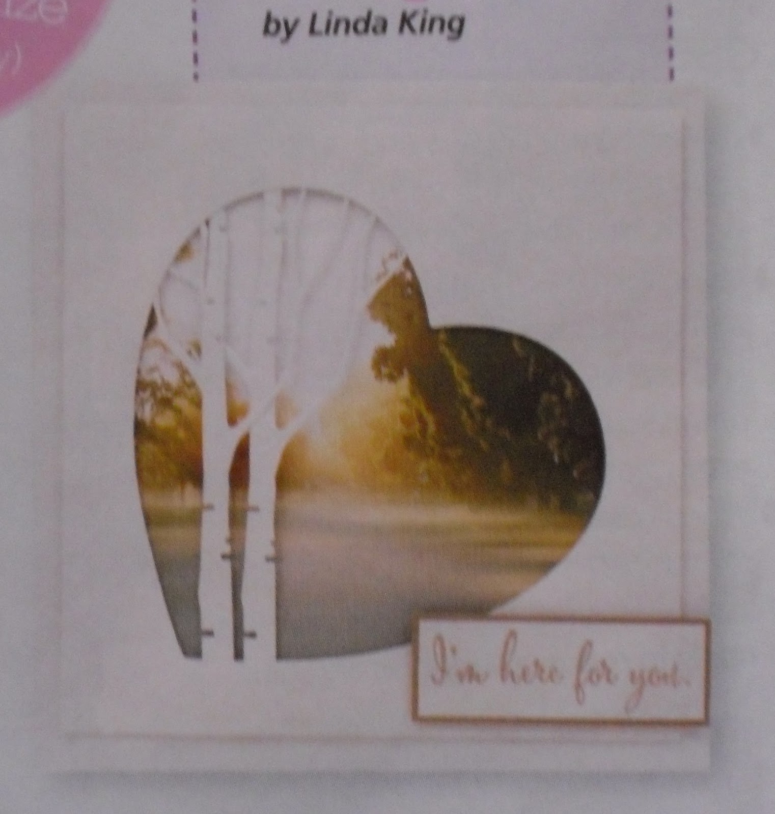
It was inspired by this card in the latest Creative Stamping (Issue 43)
(another mag I had to have because of the 'free' stamps) ...

Wednesday, 3 May 2017

A little birdie ..

Special card as requested by Mum for a visually impaired friend. The card is inspired by Creative Stamping (UK) Issue 41  but with lots of extra work to make it tactile as the friend can only distinguish dark and light.


The stamp set came with the magazine. I stamped the background flowers with Barn Door Distress ink and used orange and yellow Distress Embossing powders to some rough texture. The central panel was pierced on the smooth (back) side then turned over so the holes can be felt. The bird and flowers are coloured using Distress Markers scribbled on an acetate block and applied with a water brush. All layers mounted, again for the tactile aspect. The flowers were then painted over with Liquid Pearls. Rhinestones add the final textural element. How long did it take? Don't ask 😉 .

Friday, 21 April 2017

More Distress Oxides


Today was our once-a-month Friday Social Capers play day. Guided by an image from the same magazine I mentioned yesterday, I made this card.

Distress Oxide inks used are worn lipstick, fossilized amber and iced spruce. I love the way the colours stay true when overlapped. The inks were applied using an ink blending tool, then splashed with water and heat-set.

I am still deciding whether to bling it up with a few clear sequins ...

I can't wait until I get my hands on the rest of the colours in these new inks.

Thursday, 20 April 2017

Distress Oxide Inks

This is my first play with the new Ranger Tim Holtz Distress Oxide Inks. I am absolutely thrilled with them! Apologies for the shadows - trying to show the gold around the panel edges.


 My camera is not doing justice to the iced spruce colour. In the photo below I have deepened the image to try to get the effect - it is actually a gorgeous soft greenish grey.


I pressed iced spruce and vintage photo inks a little bit apart onto my craft sheet, spritzed with water and pressed smooth white cardstock onto the inks. Heated dry with the heat gun, and re-pressed to fill areas that needed more colour. Re-heated to dry, then splashed water droplets, heated again.

Used a Richard Garay embossing folder for the pine branch background (Lumberjack series - Pine Needles), then leaving the embossed card layer in the folder I sponged more iced spruce ink over the raised areas, then some fossilized amber where the sun might be hitting the tops of the branches.

I applied Rub’n Buff ‘Gold Leaf’ (remember this stuff ?) around the edges of the layer. Used StazOn Jet Black ink to stamp the wording and dragonfly (from Creative Stamping Issue 41 – UK series) onto clear film, coloured behind the wings with Copic markers (orange and blue/green), cut out and adhered with Glossy Accents dimensional adhesive, then adhered layer onto black American Craft card base.

Tuesday, 30 August 2016

CASEing a Card (CASE = cardmaking term for CopyAndShareEverything)


Jo's original card
Jill's CASEd card

As a beginner card maker, I often  found myself wanting to copy cards we made in the classes I went to in EVERY detail – measurements and positions exact to the millimetre, colours matched perfectly, exact products and embellishments used.
I now try hard not to do this, but I recently needed a card in a hurry and had planned to CASE one of Jo’s cards. Things however did not go quite as planned.


I thought I would share my thought processes involved in the process, in the hope of encouraging people to change cards to suit the product they have at home.

1.       Spend an hour searching for the Couture Creations 6” x 6” paper pad that I knew I had ‘somewhere’. It is purple – I must have bought this one! Found it eventually, but it was NOT the one Jo used. Mine was pink  - pretty, but not what Jo had used. Oh no – what do I do now?
2.       Find an alternative paper pad (Kaisercraft, from years ago) with three sheets of coordinating paper and choose cardstock to match. Cut these to size (tempted, but no I did NOT measure Jo’s card), and cut matching backing layers from card.
3.       Choose Brushed Corduroy Distress Ink to sponge around the edges of the paper panels. Drat – I meant to choose Frayed Burlap ink – hope no one will notice the Corduroy beneath the Burlap.
4.       Discover that the die I thought was identical to Jo’s doily die is much bigger than Jo’s and not suitable. ‘Not Happy, Jan.’
5.       Choose another large die and fussy-cut around the central part of the die-cut to make a suitable doily. Did I mention that I needed this card in a hurry? And that of course I had to find my metal  shim to use with the die?
6.       Discover that my flower die is much smaller than Jo’s but by now I am getting comfortable with changing things. Make three flowers, sponging Abandoned Coral ink around the edges. Shape the flowers and glue the layers together. Yes, this step took forever. And I got ink all over my fingers. But I am in my element now and enjoying the process.
7.       Choose a matching grey card for the leaves, and use a coral coloured alcohol marker to colour silver rhinestones. I have accepted this card will take ages – we’ll probably have baked beans on toast for dinner.
8.       Stamp three different wordings using VersaFine Sepia Ink, before finding one that I am happy with. First one was too big, second stamp is what I want but it stamped unevenly. Of course.
9.       Play with the layout of doily, flowers and wording. Take a photo before lifting things off to put mounting foam behind them. Thank goodness for phones with cameras on them.
10.   Change the placement of the final bits of bling because there are butterflies on the vertical paper panel and the groups of 3 stones won’t work.
11.   Admire the card made in a ‘hurry’ – yes it took far far longer than planned. And no we did not have beans on toast for dinner.
12.   Thank you Jo for providing the inspiration for this ‘quick’ card. It was for a paid order … wonder if I can charge for time ... is $80 excessive??


Thursday, 12 May 2016

Birthday Vellum


It's my MIL's birthday today. Still inspired by the Clear & Sheer class and by Jennifer McGuire, I traced the Altenew flower and leaves in white pencil onto heavy parchment vellum. I embossed from behind then coloured (also from behind) using blue and grey Copic markers. I also printed the message from the computer and traced in white pencil, then embossed from behind. I adhered the sequins using Glossy Accents then put more Glossy Accents behind the sequins to adhere the small piece of white backing card.
I adhered a half card-sized panel to the inside of the card to support the vellum. Knowing the adhesive would be visible from behind, I embossed a line where it would be to make a feature of it.